Fresh beverage producer
D2C · narrow product range
summary
- came in
- An order site built on a ready-made theme and plugins that could not carry the rules of daily production and morning delivery.
- examined
- The state of the current site, competitors' order flows, delivery rules (area, day, time slot), regulatory gaps (KVKK, distance selling, food labelling) and the business's operational needs every morning.
- decisions
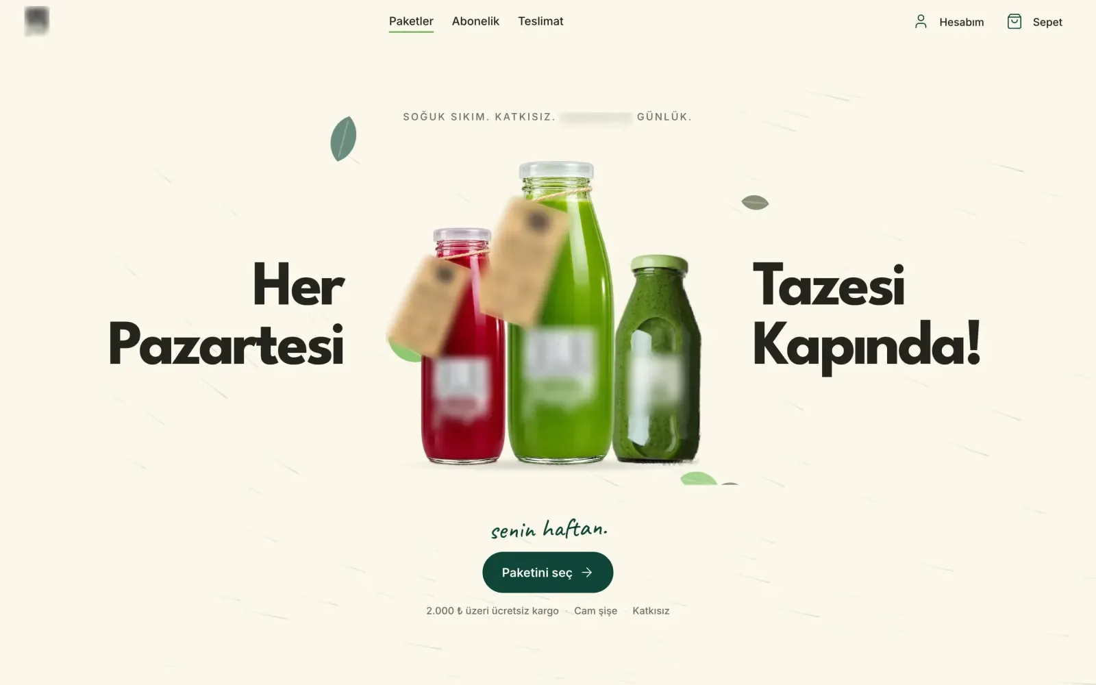
- Not classic e-commerce for a narrow range, but a storefront that leads to the sale and a panel that runs the day; a light build from scratch instead of a theme. The delivery day is chosen on the product page, checkout is three steps without an account. Scope was narrowed with cut lines; subscriptions and build-your-own packs moved to a later phase.
- techniques
- Laravel, Blade, Alpine.js, Tailwind, Vue + Inertia (panel), design system, delivery day and time slot rules, Pest.
Where I looked
The current site was built on a ready-made theme and plugins. I compared its state with competitors' order flows: its weakest points were legal information and the order flow. Its strength was in place: same-city morning delivery and a ready subscription model.
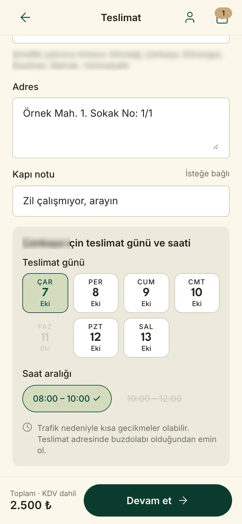
The catalogue is small but the rules are many: production is daily, delivery goes only to certain areas in a morning time slot, Sunday is closed, the earliest delivery is two days out. Off-the-shelf e-commerce patterns struggled to carry these rules. And every morning the business was looking for the same answer: how many bottles to prepare today, which address they go to, which payment is pending.
What I did and delivered
- State review and comparison. A review of the current site and the competitors, and a one-page summary of the same findings without measurement jargon.
- Design system. Colour, type, spacing and components came first; pages were assembled from them. Screens that were never drawn separately (sign-up, member dashboard) could be built straight from the system.
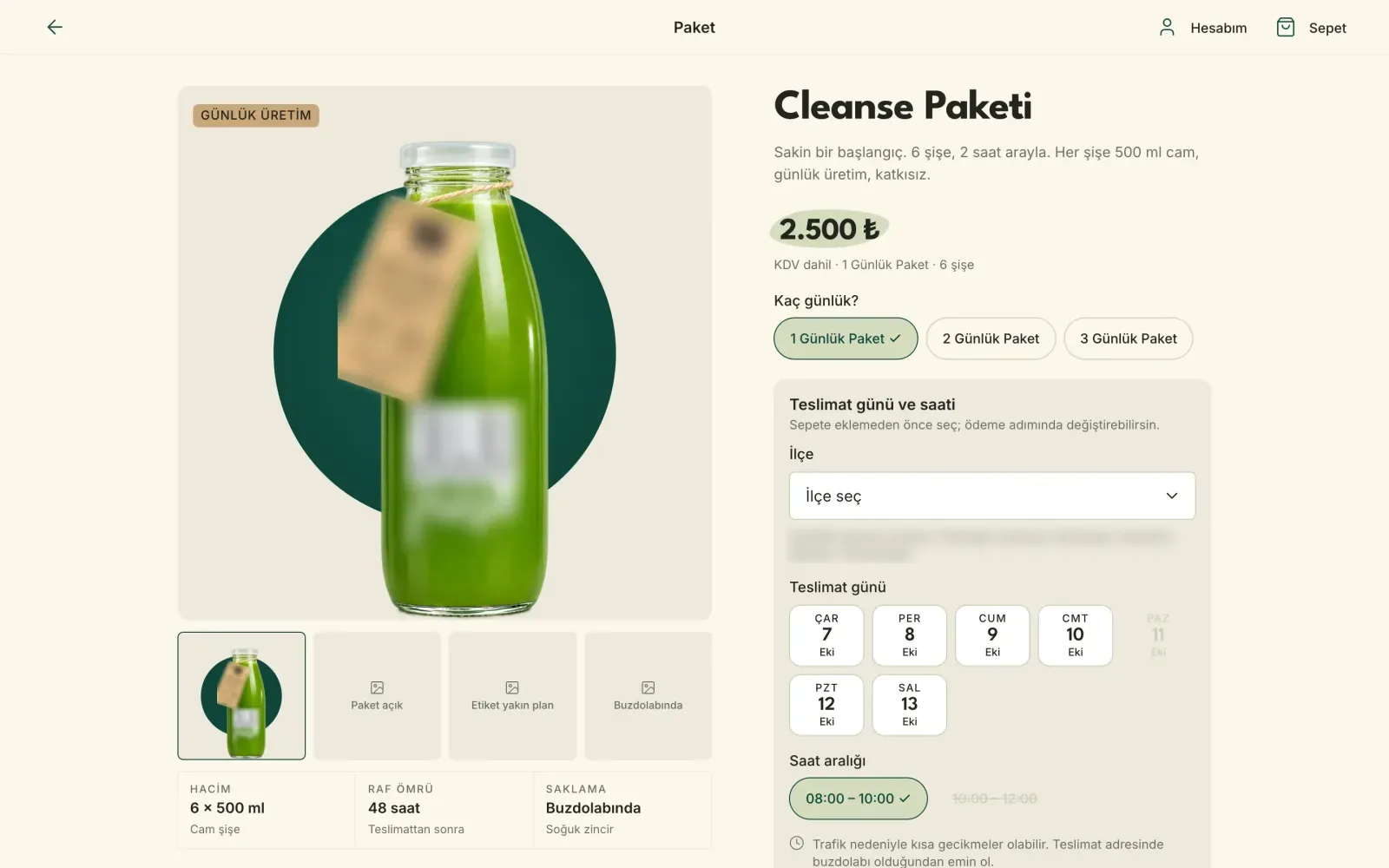
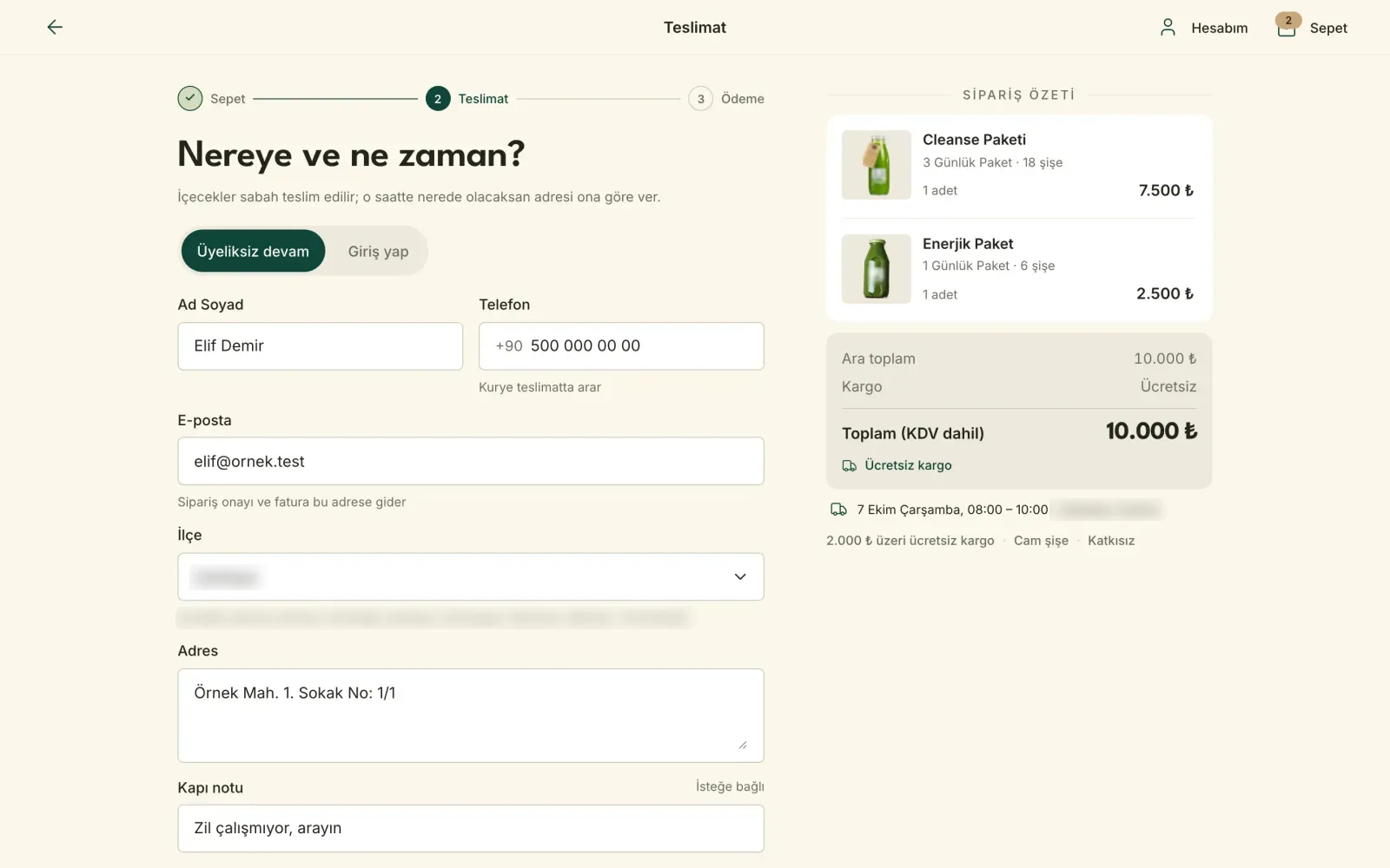
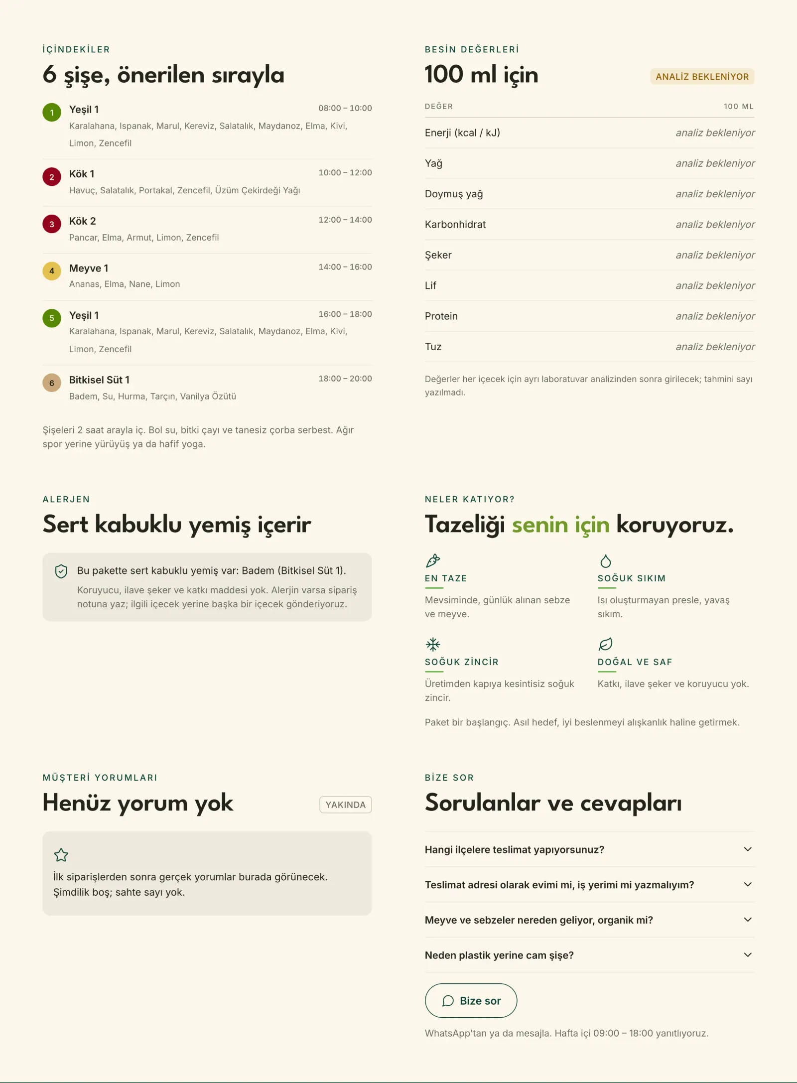
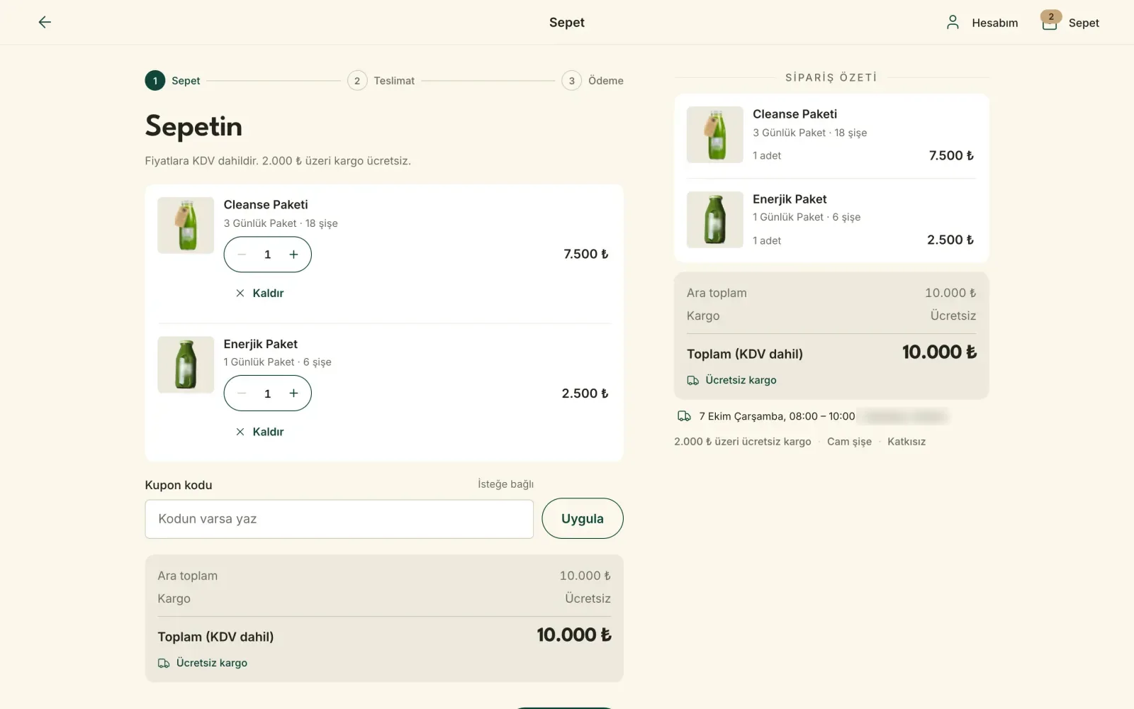
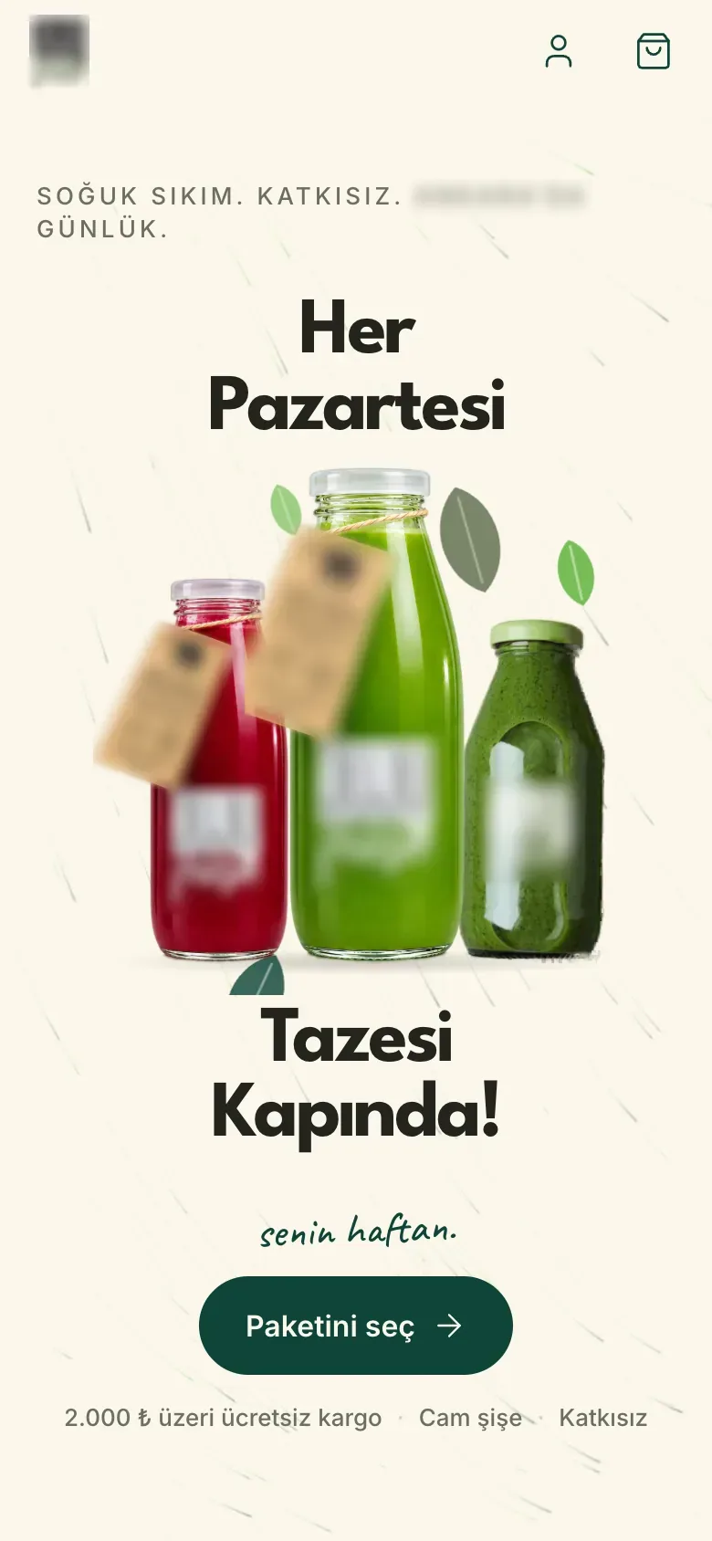
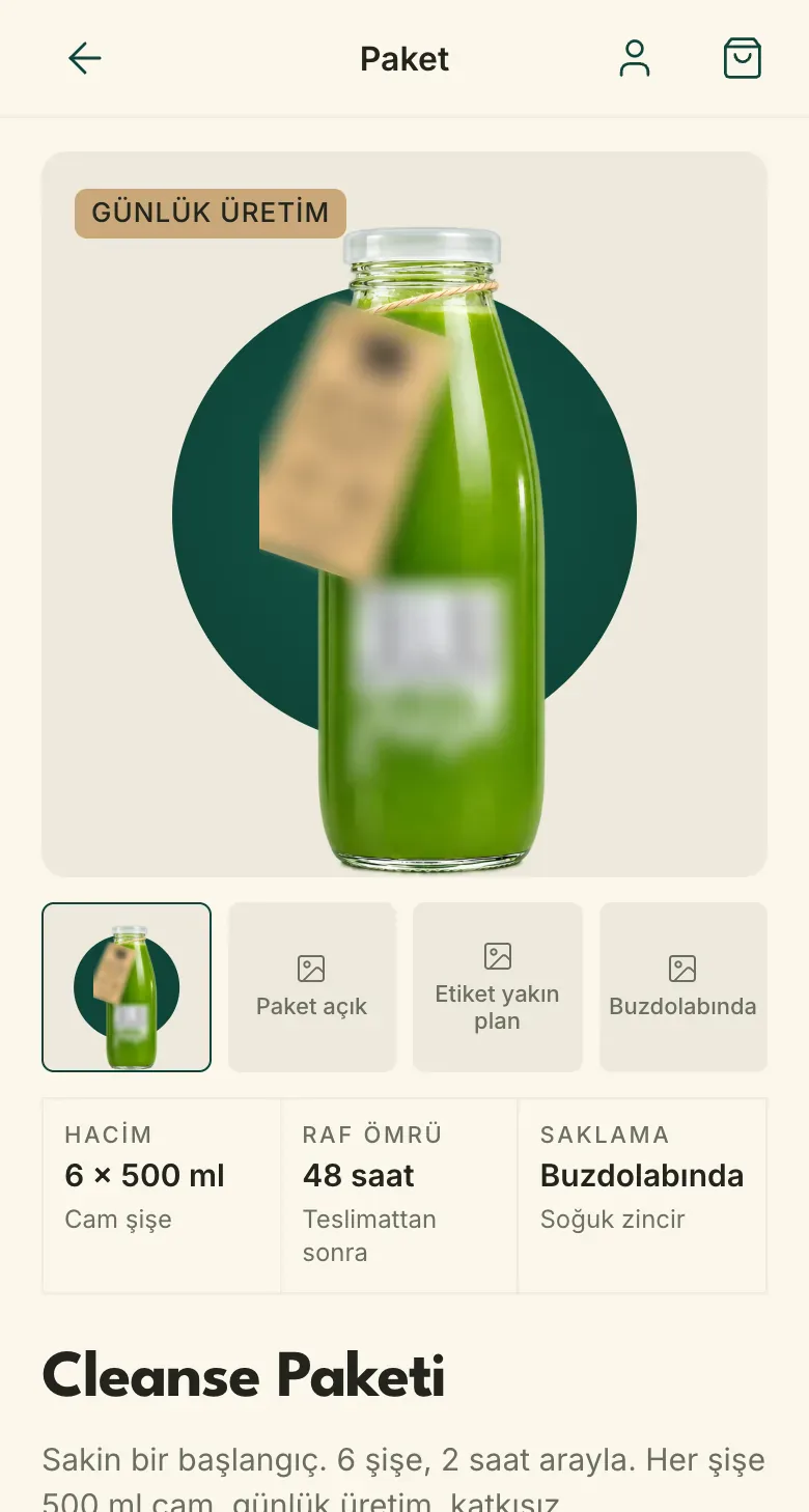
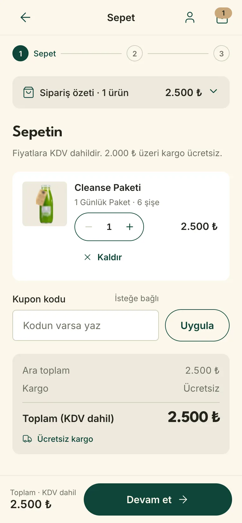
- Storefront and checkout. The home page; a product page with a delivery day picker, ingredients, nutrition, allergens and FAQ; a question dialog that keeps the product context; the cart and the front end of a three-step checkout.
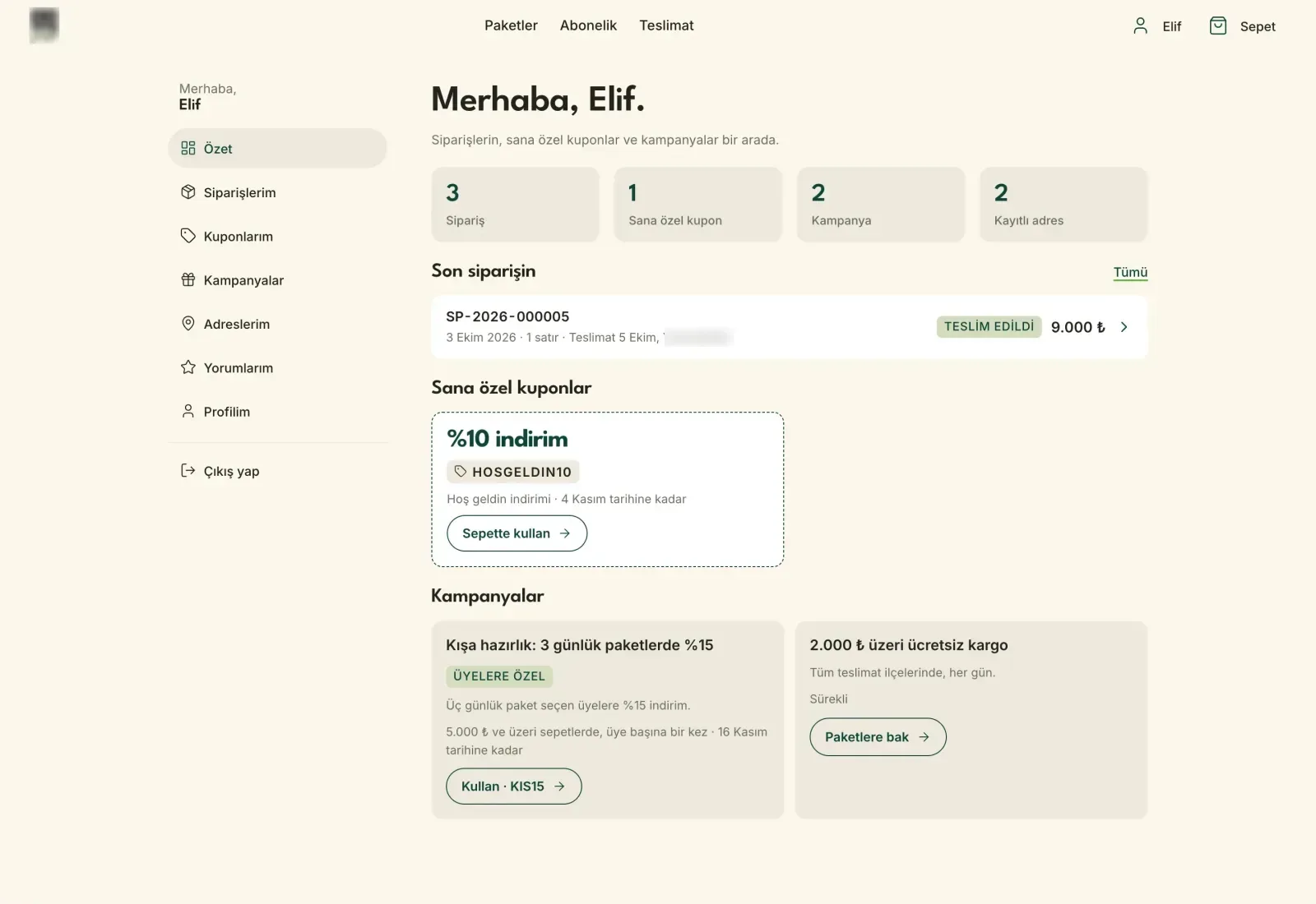
- Accounts and member dashboard. Sign-in, sign-up, password reset; past orders, personal coupons, campaigns and addresses on the dashboard. "Order again" and "write a review" for delivered orders.
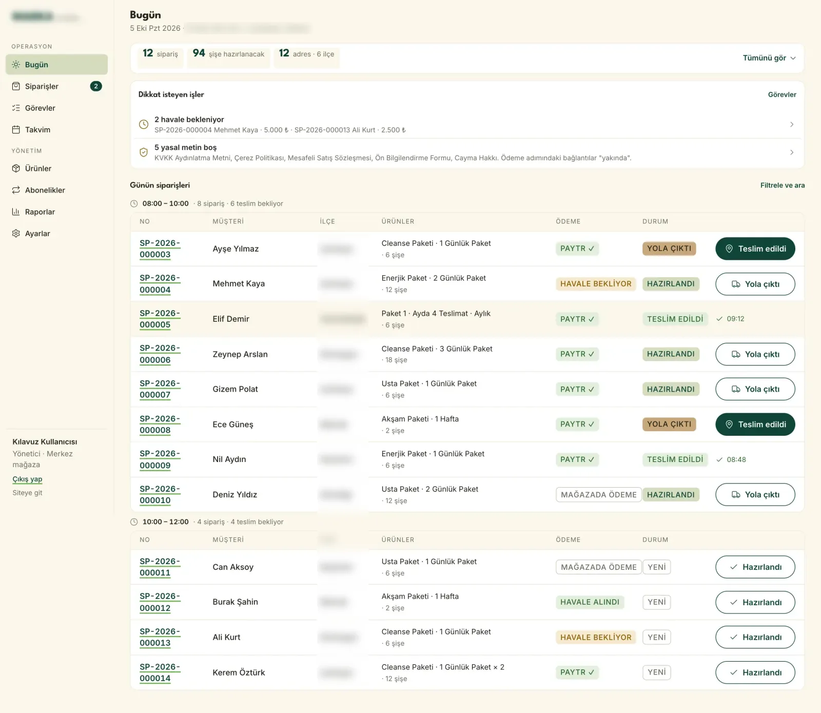
- Admin panel, first phase. A "Today" screen, order list and detail: advancing status, confirming bank transfers, cancelling, notes, export.
Decisions
- Small catalogue, big operation. Rather than classic e-commerce for a handful of packs, I focused on two parts: a storefront that leads to the sale and a panel that runs the operation.
- From scratch, light. A small build that keeps performance and maintenance in hand, instead of the weight of a theme and plugins.
- Delivery day on the product page. If customers learn the delivery limits at checkout, they abandon the cart. Area, day and time slot are chosen on the product page; an unserved area triggers a warning at once. Date rules live in one place and use the business's time zone.
- Three-step checkout, no account needed. Cart, delivery, payment. Legal consents are separate and required; marketing consent is separate and optional.
- Regulation is an acceptance criterion, not an add-on. KVKK notice, cookie preferences, distance selling and pre-contract information, VAT-inclusive prices, food label fields and seller details were designed as steps of the flow.
- Not inventing missing data. Without a lab analysis the nutrition table says "analysis pending"; without reviews it says "no reviews yet". No fake ratings or numbers.
- The right price lives on the server. The on-screen calculation only updates the summary; the server decides the amount. Coupon conditions are checked on the server too.
- The "Today" screen. The panel opens with the day's order, bottle and address counts; pending transfers and missing legal texts come first; orders are grouped by time slot and advance with one click.
- Managing scope with a cut line. What would not make the first release was written down at the start: subscriptions, build-your-own packs and review moderation moved to a later phase.
- Handover-ready code. Working documents and secrets were kept out of the code.